One of the most frequently asked questions we get are about the colors and formats of files. Specifically, the file type easiest to work with and what color profile the file should contain. Our recommendation is: High Resolution PDF with 1/8th inch bleed on each side in CMYK format. However, even when all the correct steps are taken, there is a chance that the colors on the screen will not match the ones being printed. This is because of the way that colors are created on a screen and on print. It is also why at Kendall Press, we always print out samples for our customers before printing out large batches of product. In this article, we will talk about how to decrease the variation between digital and printer color profiles as much as possible, and the reasons behind the variations. Why do files look different on screen from when they are printed?
RGB vs. CMYK
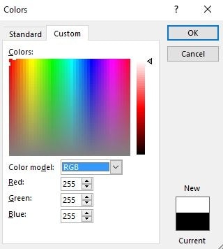
Let’s start with some basics. Many people know about the two major color formats: CMYK and RGB. RGB simply stands for Red, Green and Blue, while CMYK stands for Cyan, Magenta, Yellow and Black. The two methods however, differ in more than just which colors are used as the base, but also how they are used to create new colors. Specifically, the RGB color wheel is additive and used widely in electronic displays; it uses light and adds RGB values to create different colors. CMYK is subtractive; it creates different colors by removing different CMYK values. This becomes easier to understand when you consider that in CMYK, light is being reflected while in RGB, the light is being created. If you look at the pictures sampled below, RGB is used in screens to produce colors. This color creator is from Microsoft Word. When creating the color white, notice how RGB all have full output (255).

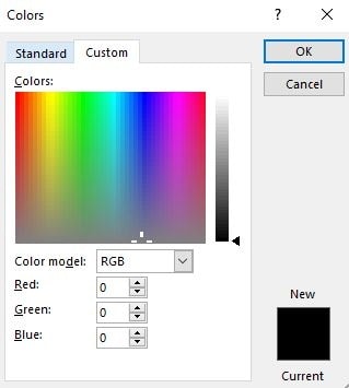
When producing the color black, the screen simply produces 0 colors.
Comparing that to CMYK; white is the base value with 0,0,0,0, and CMYK values are added to reflect different colors. Interestingly, in CMYK, there are multiple black colors. One, obviously being just 0,0,0,100. Another, is the black that is created from simply converting RGB black into CMYK (this ends up being 75,68,67,90 in CMYK).
What Does this Mean to Me?
This means that even when switching color formats on your screen, the screen itself can only do its best to imitate what the colors would look like on paper. This has a lot to do with the fact that screens have a back light, while printed material reflects light. There is also the consideration that certain screens have different resolutions and quality which can further impact the difference between what is seen digitally vs. what is printed. A good general rule of thumb to limit this differentiation is to keep your screen brightness at 50%. Avoiding neon, or extremely radiant colors can also help as they generally don’t translate well on paper. However, it is important to note that most of the time, for everyday, personal printing needs, these color changes are unnoticeable. Kendall Press, being a printing company that deals only with excellence, we have to make sure that everything is as close to perfect as possible. This is one of the reasons why we print samples before printing large quantities of product.
The Adobe Suite Color Dilemma
It’s been reported that when opening files that contain Pantone colors, using Adobe, the color values shown can sometimes vary between different Adobe programs. This is because the formula that Adobe Illustrator/InDesign/Photoshop uses, can convert Pantone colors into different CMYK values.

The problems comes when Adobe Illustrator, In Design, and Photoshop convert Pantone colors into different CMYK values through Adobe’s own formulas. However, Pantone is the international color standard. this means that all the standard Pantone colors should have the same values throughout the Adobe Creative Suite program. Because we are not just a printing company but also do design work, among other services, we realized that the colors sometimes come out differently. So we reached out to Pantone, purchased and installed the Pantone Color Manager to standardize colors in our software, thus giving us an edge in making sure that the colors we see on our screens, match as much as possible to the ones that will be printed. Of course there also metallic colors that are printed through a printing press. By nature, these colors are near impossible to represent digitally because of how they reflect light.
Hopefully this information is helpful for you as a lot of it is unknown. The knowledge of the Adobe Suite incorrectly translating Pantone colors is one that is uncommon even within the printing industry. As the highest-rated printing company in the Boston and Cambridge area we’re here to help with any questions you may have .
